
RESEARCH
Market Research
To identify segments of the target audience and the market it is important to understand the disposable income and discretionary income.
From Fig 1. it can be identified that the disposable income is almost the same for the age groups, 25-34; 35-34 & 35-44.
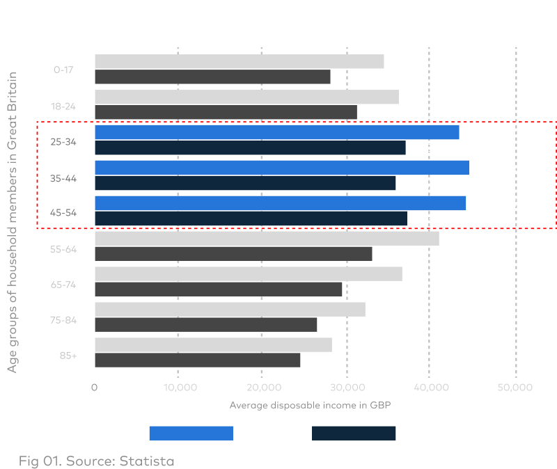
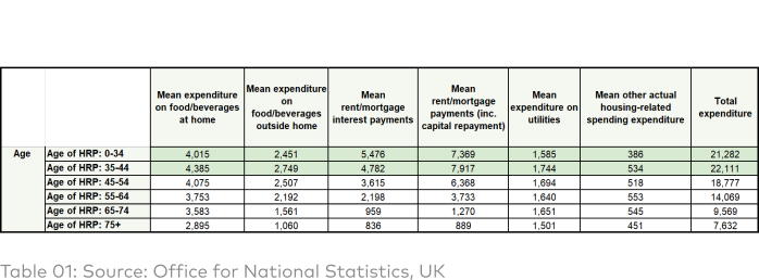
Table 1 shows expenditure by various age groups on essential groups. Hence from Fig 01 and Table 01, it can be inferred that both 25-34-year olds and 35-44-year-olds have roughly similar amounts of discretionary income that they can allocate for other non-essential activities which is ~ £22,000/yr.

Looking at Fig 02, the market for discretionary income for the age groups are as follows.
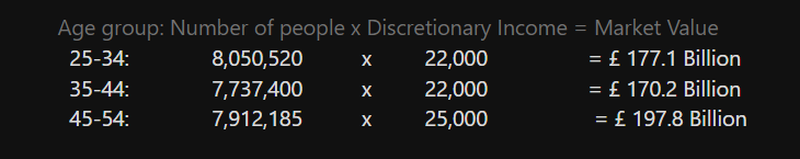
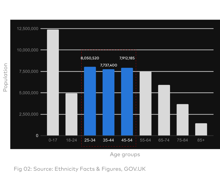
The markets of age groups 45-54 and 35-44 are saturated and tapping into even a small percentage of the unsaturated 25-34 market would be highly profitable.
🧠 My Bias
After completing my desk research, I believe/feel that Vanguard’s target audience is high net-worth individuals who are already well-versed with investment jargon and the current services aren’t friendly for 25-34 year olds or first-time investors.
 Testimonial from Vanguard UK website
So why didn’t they invest years ago?
DEFINE
Understanding the
Understanding the
Customer
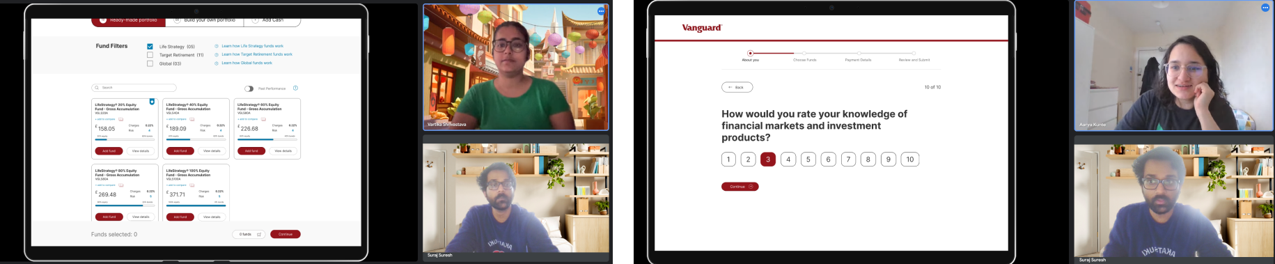
I conducted a few interviews with participants in the age group 25-34, to understand their pain points, after the interview I conducted an activity (user testing) with the participants on creating an account with Vanguard to understand their experience in doing so.
In the activity tasks were
1. Create an account with Vanguard
2. Invest with Vanguard
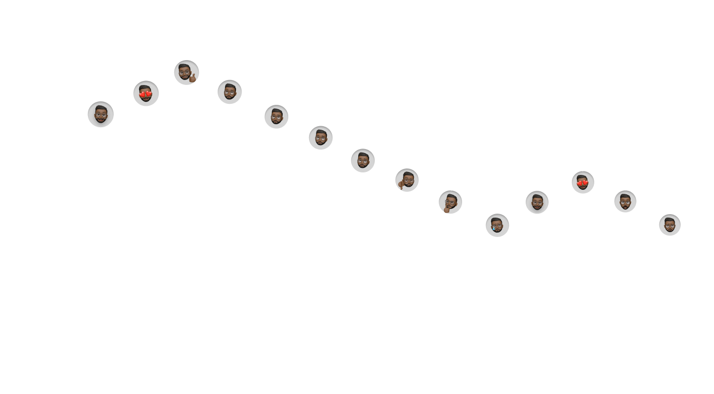
This was the mapped customer journey during onboarding, it can be seen that the major dip in the customer experience was not finding information about the funds in a crisp manner.
![]()
In the activity tasks were
1. Create an account with Vanguard
2. Invest with Vanguard
This was the mapped customer journey during onboarding, it can be seen that the major dip in the customer experience was not finding information about the funds in a crisp manner.
Current User Flow

🤕 Customer Pain Points
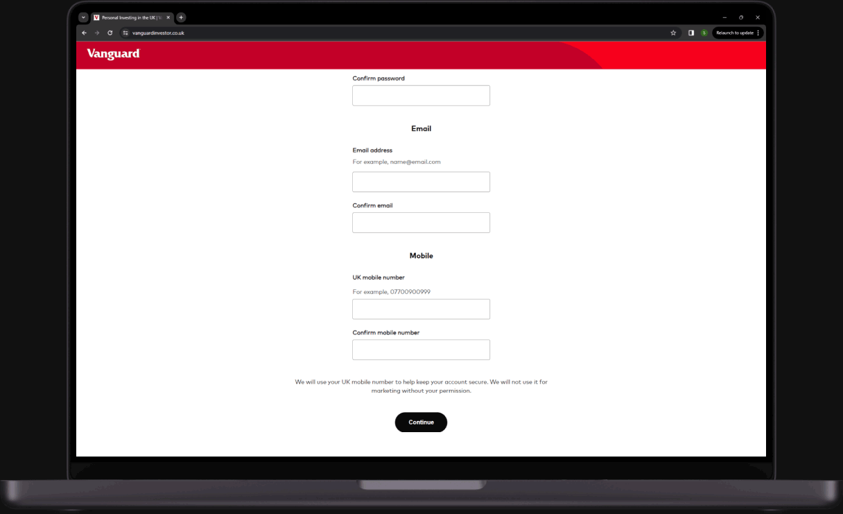
After the ‘Create Account’ page it is the ’About you’ page, both pages communicate in a different visual style and this causes a lack of brand coherence causing slight confusion among new customers.
[May 04th, 2024 Update: Vanguard has fixed this issue]
[May 04th, 2024 Update: Vanguard has fixed this issue]
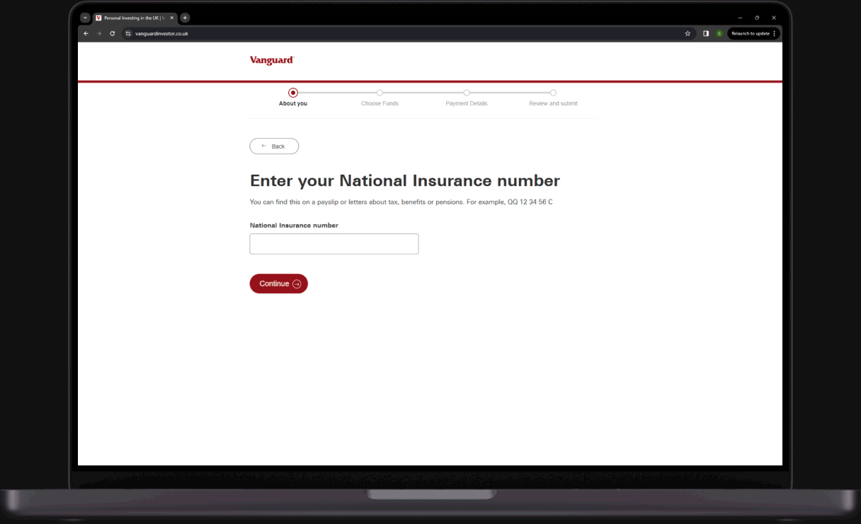
The Progress bar makes an irregular jump from ‘About you’ to ‘Payment Details’ on the ‘Choose funds’ page causing minor anxiety in new customers.
[May 04th, 2024 Update: Vanguard has fixed this issue]
[May 04th, 2024 Update: Vanguard has fixed this issue]
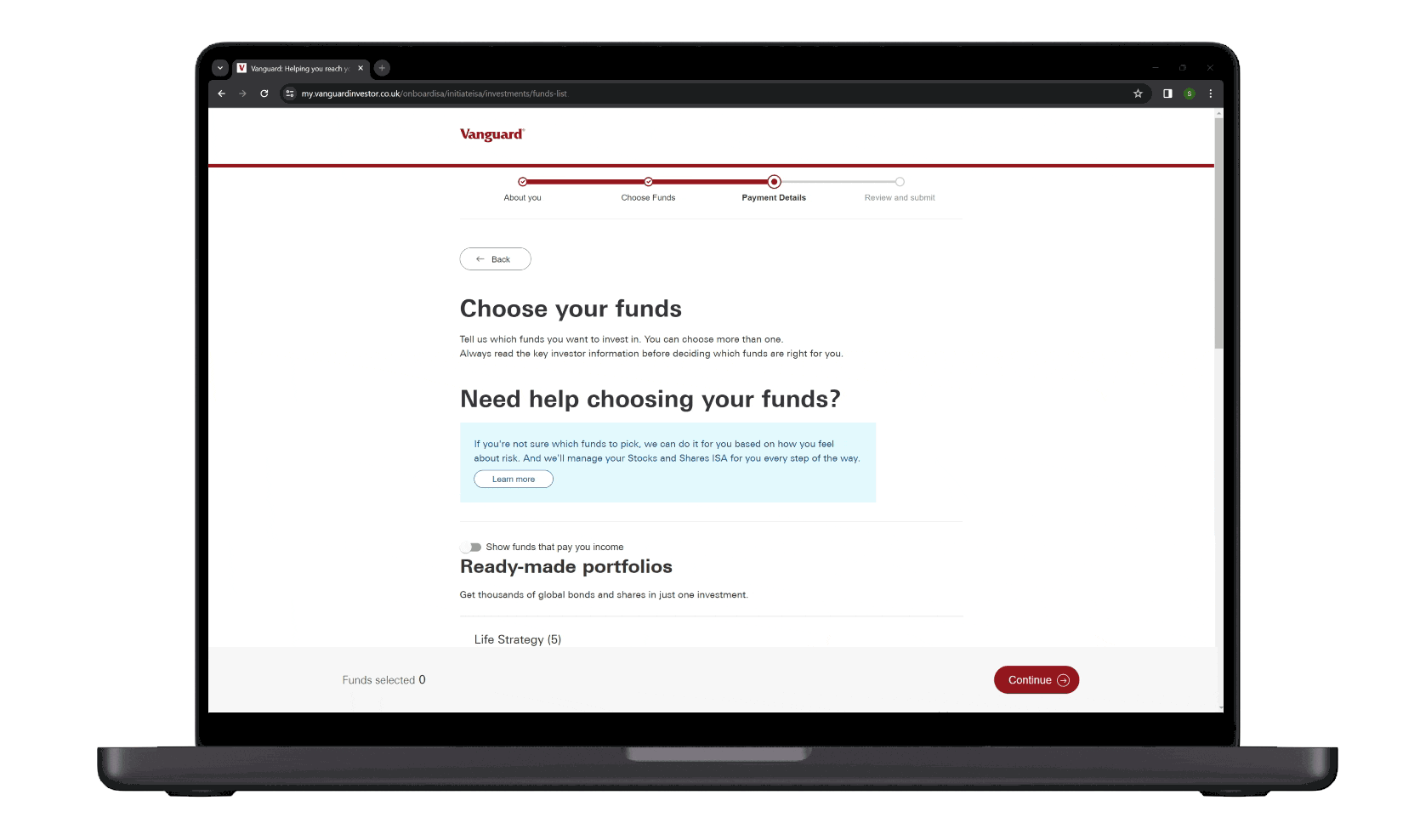
Some of the participants mentioned that they felt that they were forced to pick a fund for fear of not being able to progress in the onboarding section and access Vanguard’s investment products.
👤Personas


✨Synthesis
The purchase process for Ethan & Fathima could be broken down into 3 basic steps:
1. Understanding
So these are the how might we questions I framed for these three steps
1. How might we help users understand about each fund or fund category?
2. How might we help users discover funds that they might like?
3. How might we increase the click-through rates?
1. Understanding
2. Discovery
3. Purchase
So these are the how might we questions I framed for these three steps
1. How might we help users understand about each fund or fund category?
2. How might we help users discover funds that they might like?
3. How might we increase the click-through rates?
📝
Ideation
1. Understanding:
How might we help users understand about each fund or fund category?Idea 01: Modal/Non Modal dialogs:
“What is this xyz” educational links that lead to pop-ups with tiny short explanations.
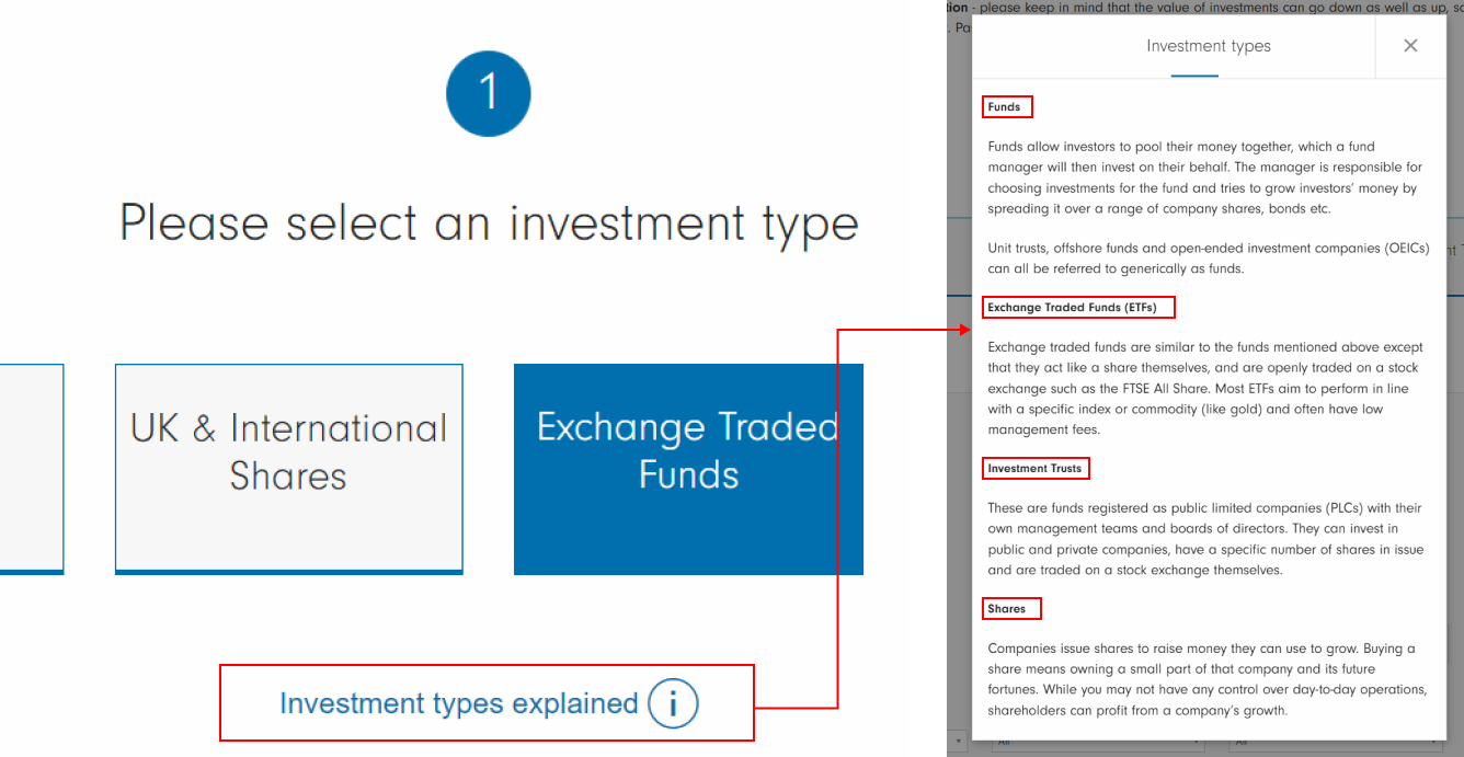
Fig: Fidelity Investments
Idea 02: Investor Personality: A short questionnaire, that tells the investor their personality based on a set of predefined personalities, and based on that they could receive recommendations on various fund types.

Fig: (L) Myers Briggs Personality types @Reddit; (R) Which flavors are you into? @Johnnie Walker
Idea 03: Glossary:
A pop-up with definitions of various terms that a new investor might come across and what they mean.

Fig: Mobile App for cycle user @Behance
Idea 04: Call Support/ Chat Systems
2. Discovery:
How might we help users discover funds that they might like?Idea 01: Filters:
So that the users can easily switch between segments to compare different funds easily rather than a drop-down of all 86 products that are currently shown.
Idea 02: A search Feature
Idea 03: Recommendations
Based on the users’ investor personality, they could be recommended funds and it could be highlighted in their search appearing on the top left of the search results.
3. Purchase:
How might we increase the click-through rates?
Idea 01: Strong information Layout
A layout where the user isn’t confused about how to travel and what to look at
Idea 02: CTA Placements
Optimal placements of ‘Add Fund’ button where currently you need to scroll at the end of the page to access the button
Idea 03: Social Proof
To provide a sense of calm and show proof that there are other people too who have bought what you are looking at
![]()
Idea 04: Comparisons
Easy way to compare charges, returns and performance of different funds.
![]() Fig: (L) Site plan comparisons @Webflow; (R) Product comparisons @HCLTechsw
Fig: (L) Site plan comparisons @Webflow; (R) Product comparisons @HCLTechsw
![]()
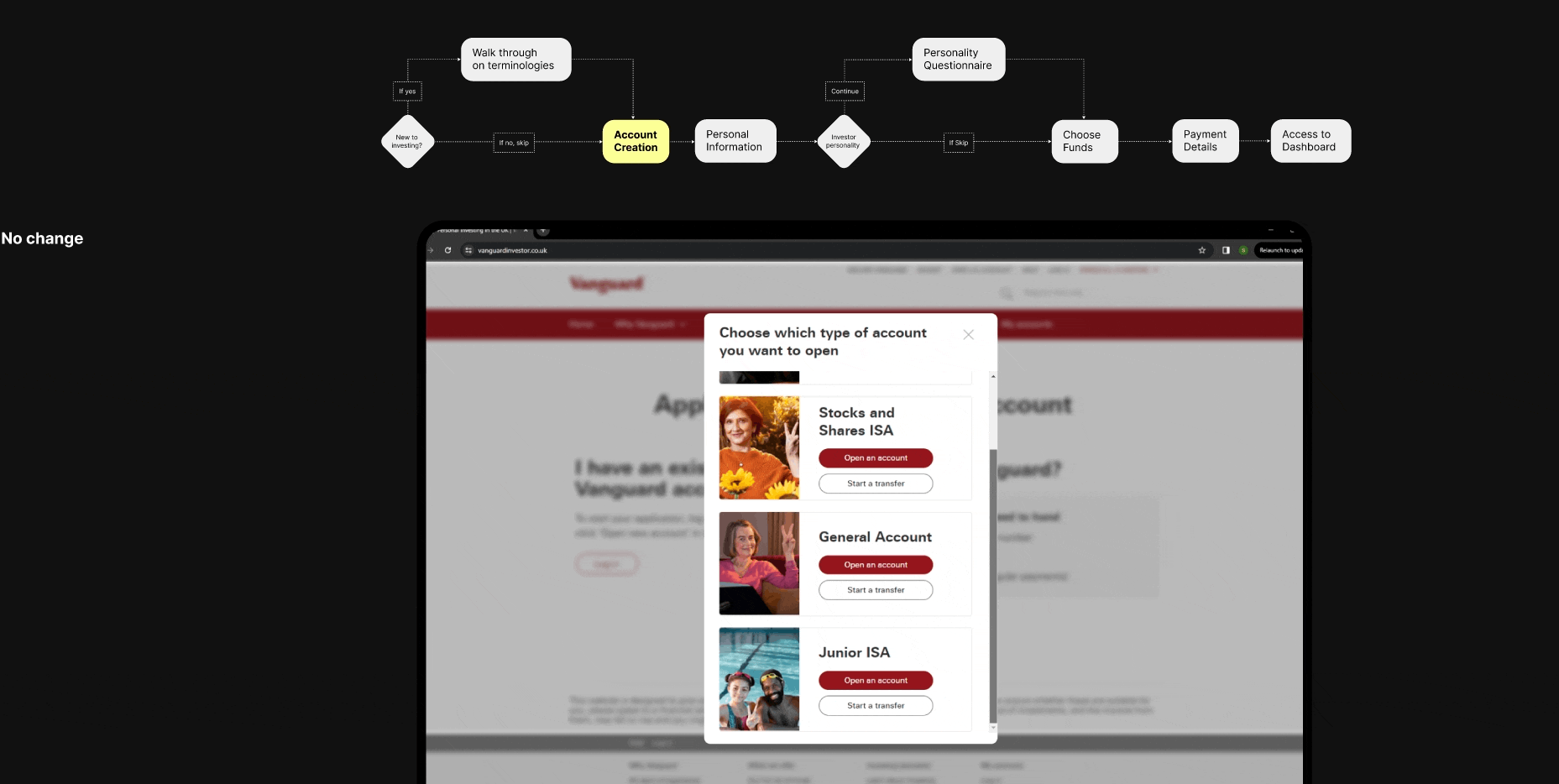
New User Flow
An expert user can skip the additional steps and proceed like they normally would.
![]()
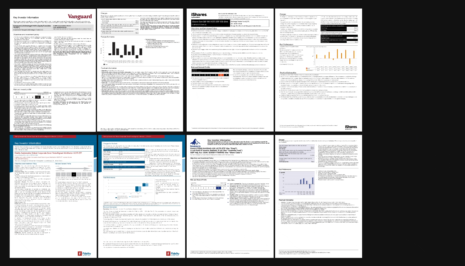
Going back to the Key Investor documents of not just Vanguard but their competitors as well there were a few common elements in all of them. Now the question arises how to display them in the existing layout?
![]()
DESIGN
Individual funds
![]()
Filter Placement
![]()
Variation 01
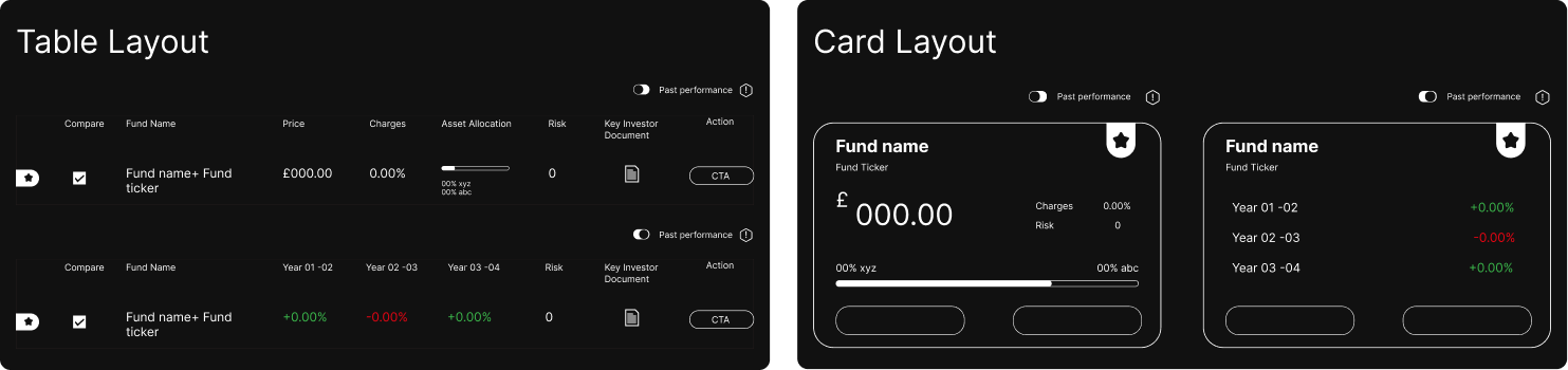
Ecommerce Layout + Table Layout
![]()
Variation 02
Ecommerce Layout + Card Layout
![]()
Variation 03
Top-Bottom Layout + Table Layout
![]()
Variation 04
Top-Bottom Layout + Card Layout
![]()
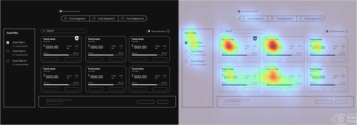
Analysing the user attention insights for the wirframes it can be seen that in Variation 04(Top-Bottom Layout + Card Layout), there is ample user attention on individual products as well as the fund filter and hence proceeding with this layout seems the most sensible.
![]()
Idea 01: Strong information Layout
A layout where the user isn’t confused about how to travel and what to look at
Idea 02: CTA Placements
Optimal placements of ‘Add Fund’ button where currently you need to scroll at the end of the page to access the button
Idea 03: Social Proof
To provide a sense of calm and show proof that there are other people too who have bought what you are looking at

Fig: (L) Social proof by David Teodorescu @UXCollectiveSocial proof in ecommerce @econsultancy
Idea 04: Comparisons
Easy way to compare charges, returns and performance of different funds.
 Fig: (L) Site plan comparisons @Webflow; (R) Product comparisons @HCLTechsw
👨💻 Idea Prioritization matrix

New User Flow
An expert user can skip the additional steps and proceed like they normally would.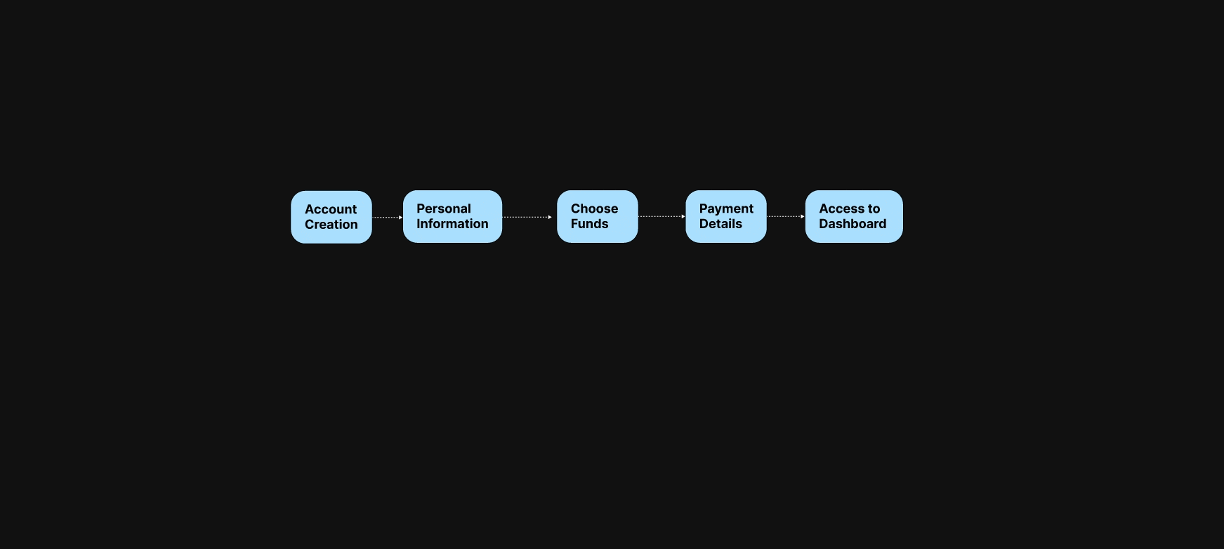
🔑 What are the key informations to Display?
Going back to the Key Investor documents of not just Vanguard but their competitors as well there were a few common elements in all of them. Now the question arises how to display them in the existing layout?
DESIGN
Wireframe
Individual funds
Filter Placement

Variation 01
Ecommerce Layout + Table Layout

Variation 02
Ecommerce Layout + Card Layout
Variation 03
Top-Bottom Layout + Table Layout

Variation 04
Top-Bottom Layout + Card Layout

Analysing the user attention insights for the wirframes it can be seen that in Variation 04(Top-Bottom Layout + Card Layout), there is ample user attention on individual products as well as the fund filter and hence proceeding with this layout seems the most sensible.


🪜 Next Steps
1. Create a test-ready prototype, test it with users and iterate based on their feedback
2. Create a full logical system for the investor persona and spend more time on the research on framing the questions
3. Solidify the information architecture for the overview of the fund information
4. Test out the ease of use of the “Add fund” button on the inner fund's page
5. Explore a few more options for the comparison feature
6. Research on nudging customers in an ethical manner