MY ROLE: User Experience Designer
DELIVERABLES:
1. Personas
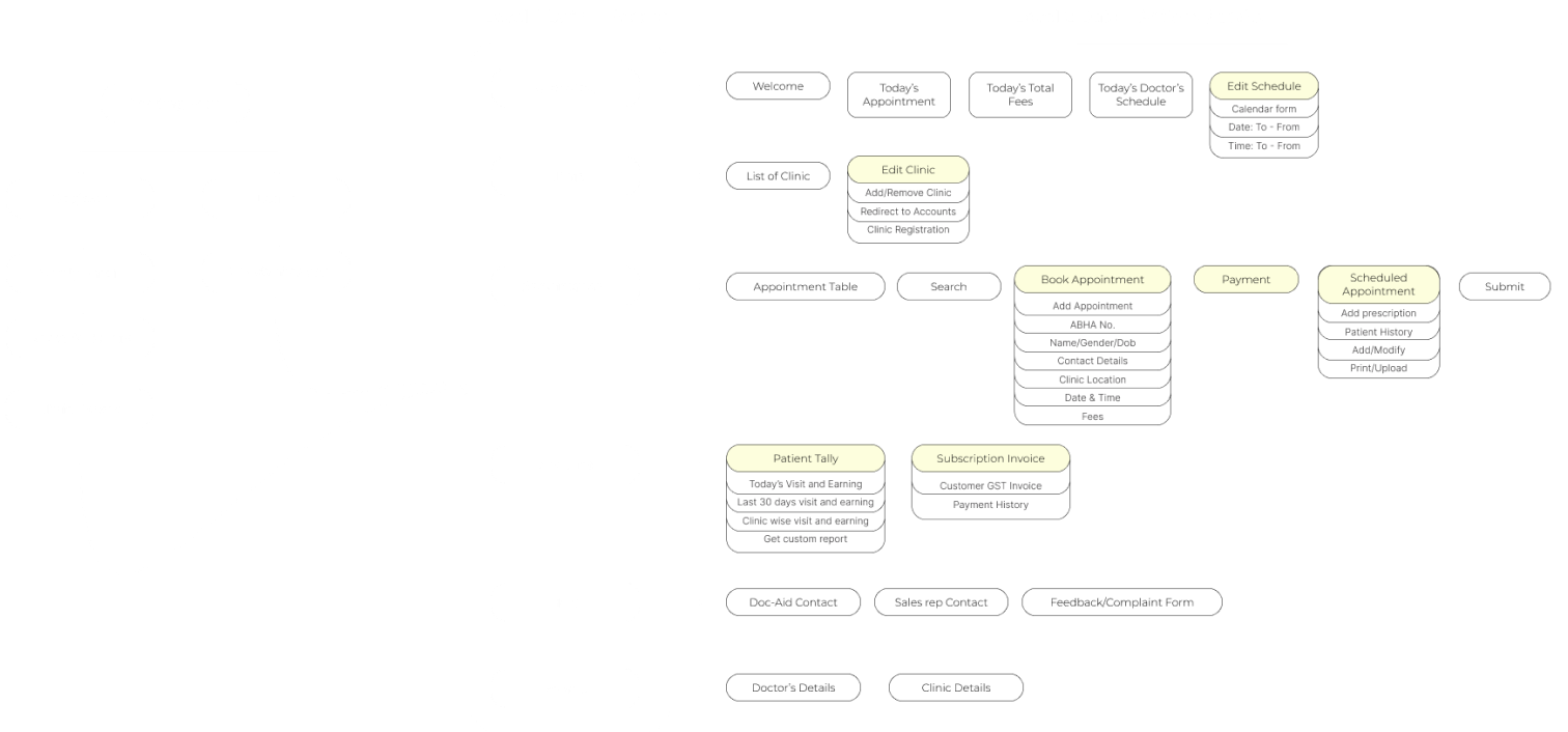
2. Information Architecture
3. Journey Maps
4. UI & UX Design
1. Personas
2. Information Architecture
3. Journey Maps
4. UI & UX Design
CLIENT: Reshita Technology Limited

CONTEXT
Overview
The Challenge
Imagine you are a doctor in a Tier 2 or Tier 3 city in India.
Bookings and patient management are done using physical paper books.
There are high chances of paperwork errors which leads to increased patient wait times.
Your compounder (who manages appointments and helps in the day-to-day in the clinic) is tech-aversive.
What can you do to leverage digital transformation and make your clinic more efficient?
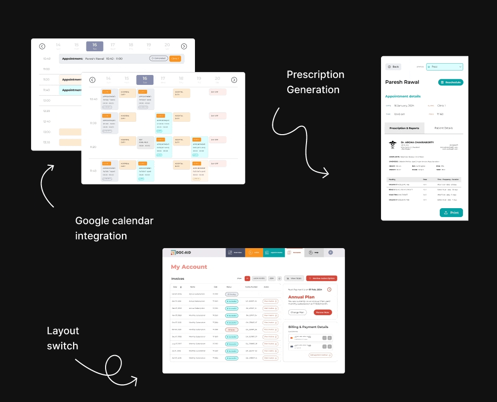
SNEAK PEEK
Solutions that increased adoption rate
Left & right handed layout / Accessibility
Google Calendar integration / Booking Appointments
Prescription Generation / Patient Details
APPROACH
Design Process
Though I am linearly showcasing this case study, the process was more cyclical, going back to research for every feature, iterating designs and testing them before handing them off to the development team in short design sprints.
In short, there were four stages.
In short, there were four stages.

EXPLORATION
Research
Business Requirements
Initially, I talked to my PM and company executives to understand the business needs and requirements and requested documentation on past research.
Competitor Analysis
Then I explored various
1. Existing patient management systems (Healthplix, eClinicalWorks, NextGen)
2. Booking appointment experiences (AirBnB, Google Calendar, BookMyShow)
Qualitative Research
I interviewed 4 out of the 17 doctors and compounders who were willing to take part in the initial research to gain insights into customer needs and preferences.
DISCOVER
46 participants in the survey
07 interviews
05 clinics for ethnographic observations
Key Findings
From surveys & ethnographic observations46 participants in the survey
07 interviews
05 clinics for ethnographic observations
DEFINE
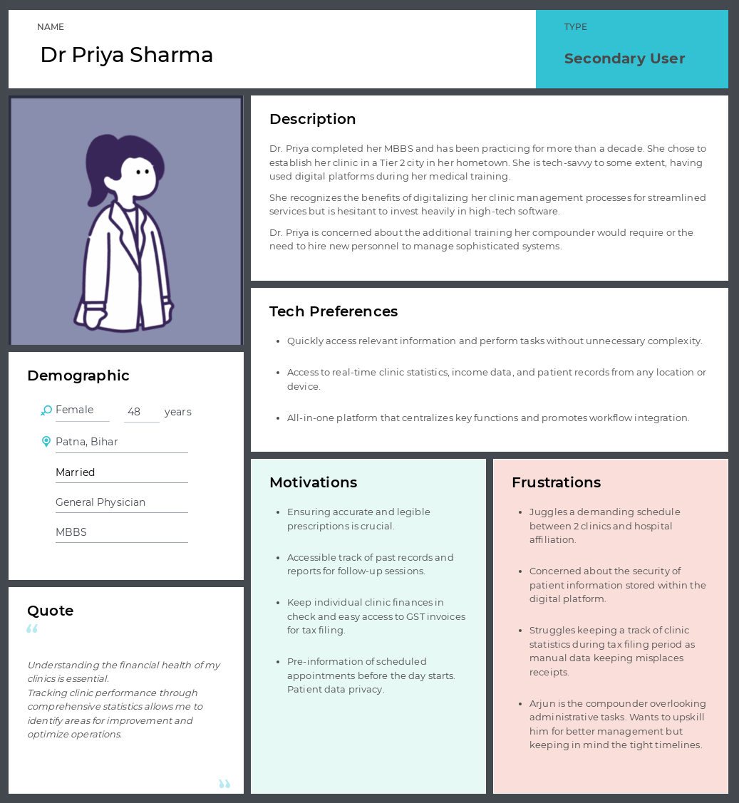
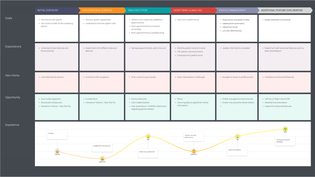
Personas
To better understand who we are designing for
Arjun Patel: Compounder
is the Primary User
Arjun Patel: Compounder
is the Primary User

DESIGN
Features
Since the primary user is a compounder ( Compounders are the other term for assistants in clinics who manage booking and day-to-day in clinics ) 48% of the compounders we interviewed weren’t tech savvy and didn’t have formal education.
Hence, the main challenge was:
How to create familiarity, intuitiveness and a touch of self-learning while navigating this system?
To address this constraint, these were some of the key features in my design
1. Color-coded elements / Navigation 2. Clear hierarchy of content / Usability
3. Hover states / Usability
4. Tooltips / Help & support
5. Left & right hand layout / Accessibility
1. Color-coded elements:
I consolidated the information presentation and color-coded the various segments, and in opposite to the general rule of having buttons & CTAs consistent throughout a design, I assigned colors to buttons & CTAs for a particular section and they remained in those colors irrespective of where they were on the screen
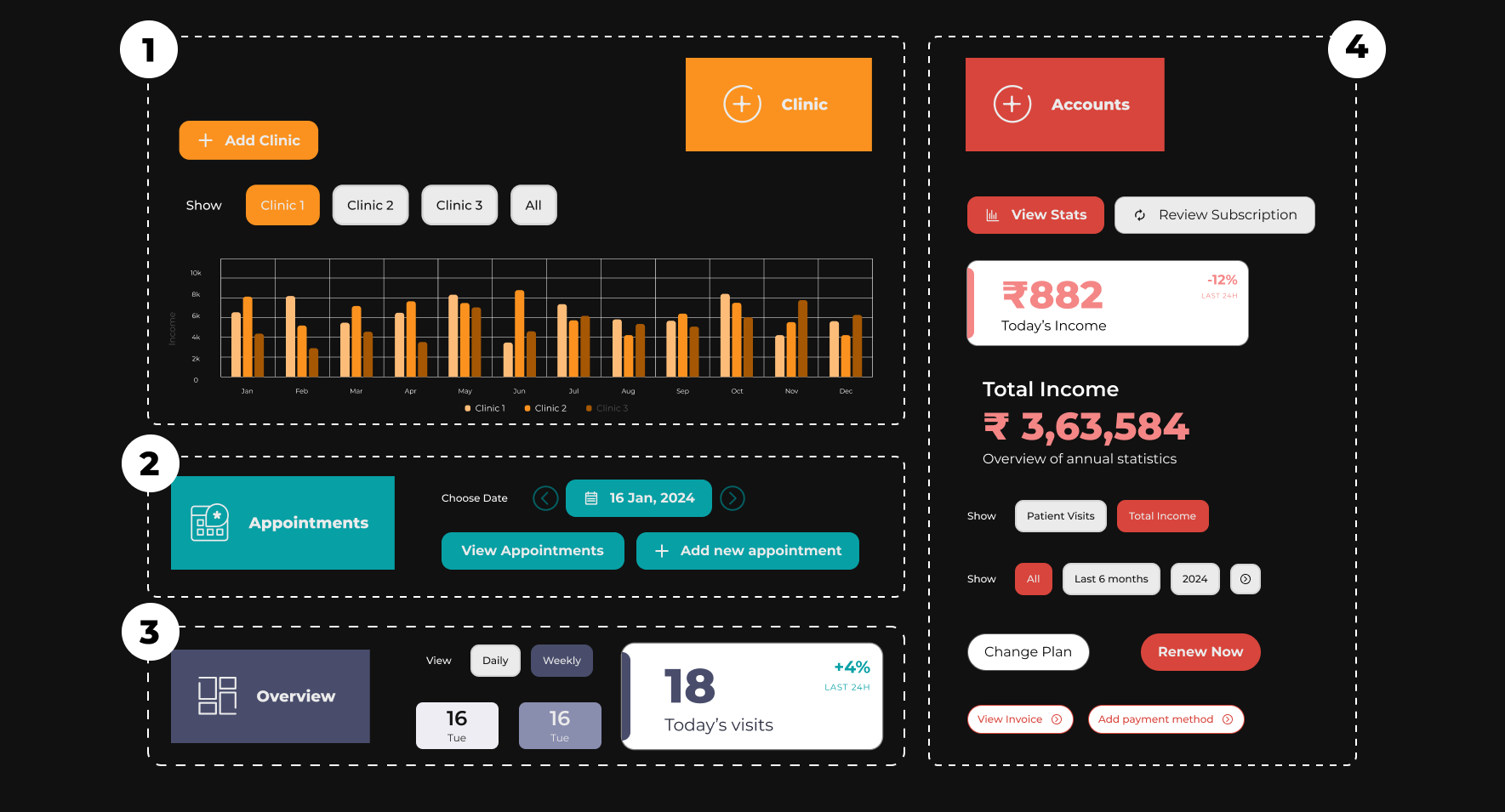
2. Clear Hierarchy of content:
I followed a 4-point grid system for a more consistent interface design, apart from spacing and padding of elements, I also figured out the various breaking points from desktop to tablet to mobile and made the necessary adjustments so that the user has a uniform experience throughout irrespective of the device that they may be using.

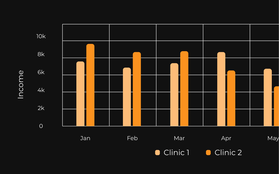
3. Hover states for data on graphs
The system has graphs, charts, calendars and tables for the compounder to manage patients, to not overload the user with additional data, rather than displaying it on the graphs themselves, the user can hover over it if and when they require such finer data.
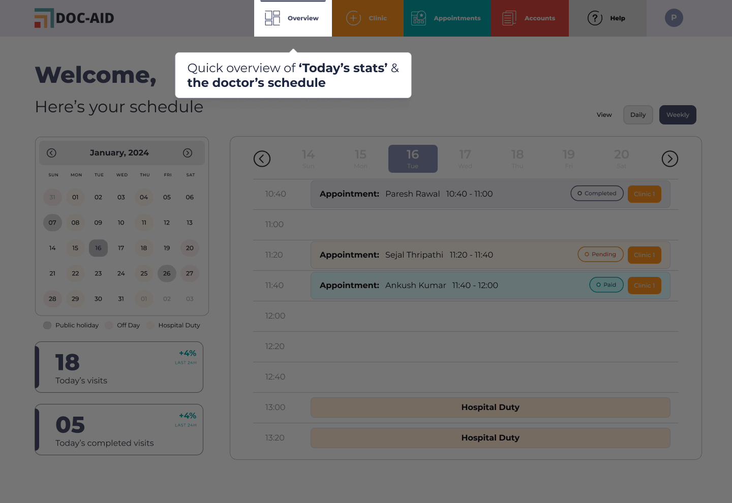
4. Tooltips:
Each page in the patient management system has tooltips to help the end user understand the interface by themselves. The tool tips can be accessed from the ‘Help’ section on the menu bar on any page.
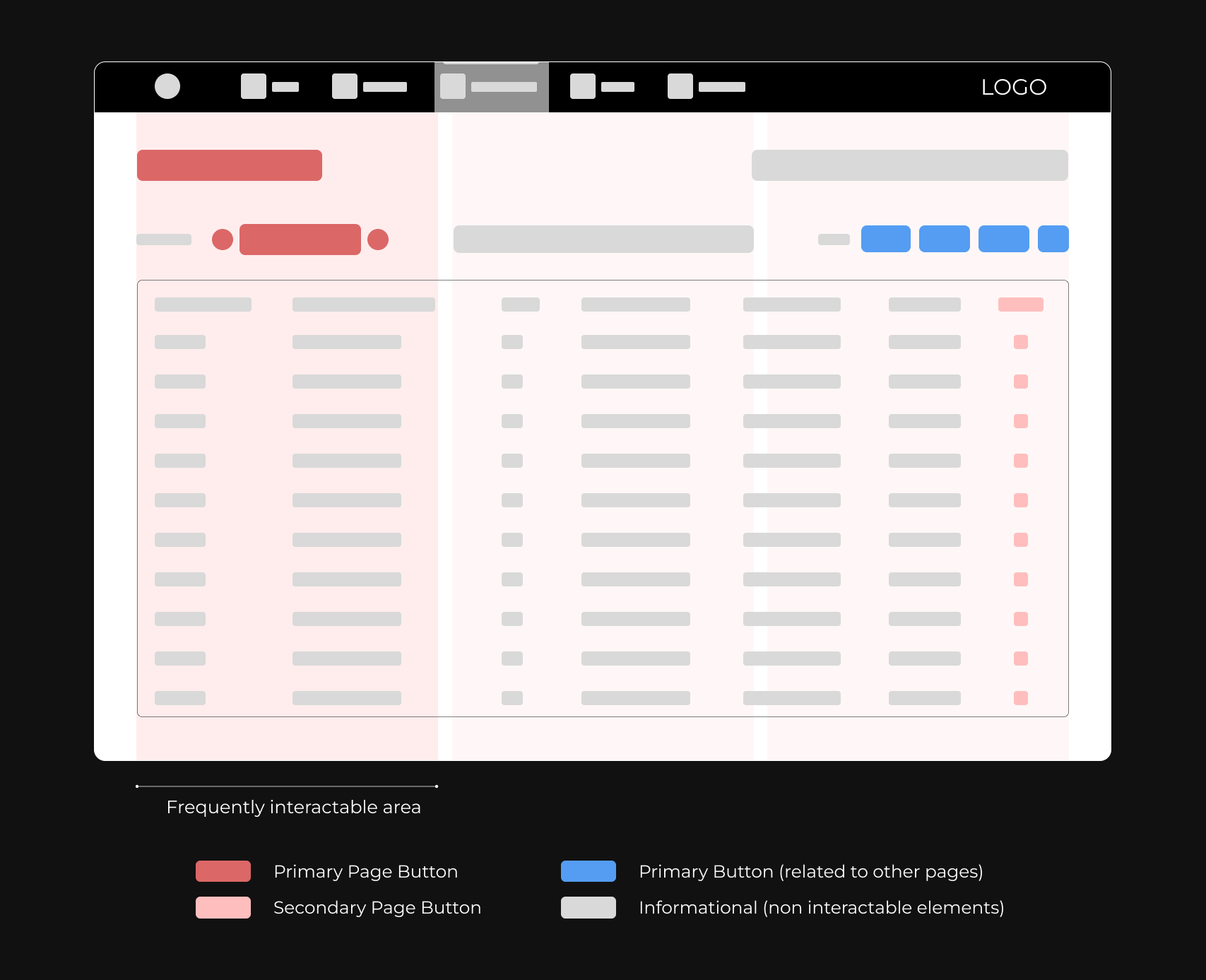
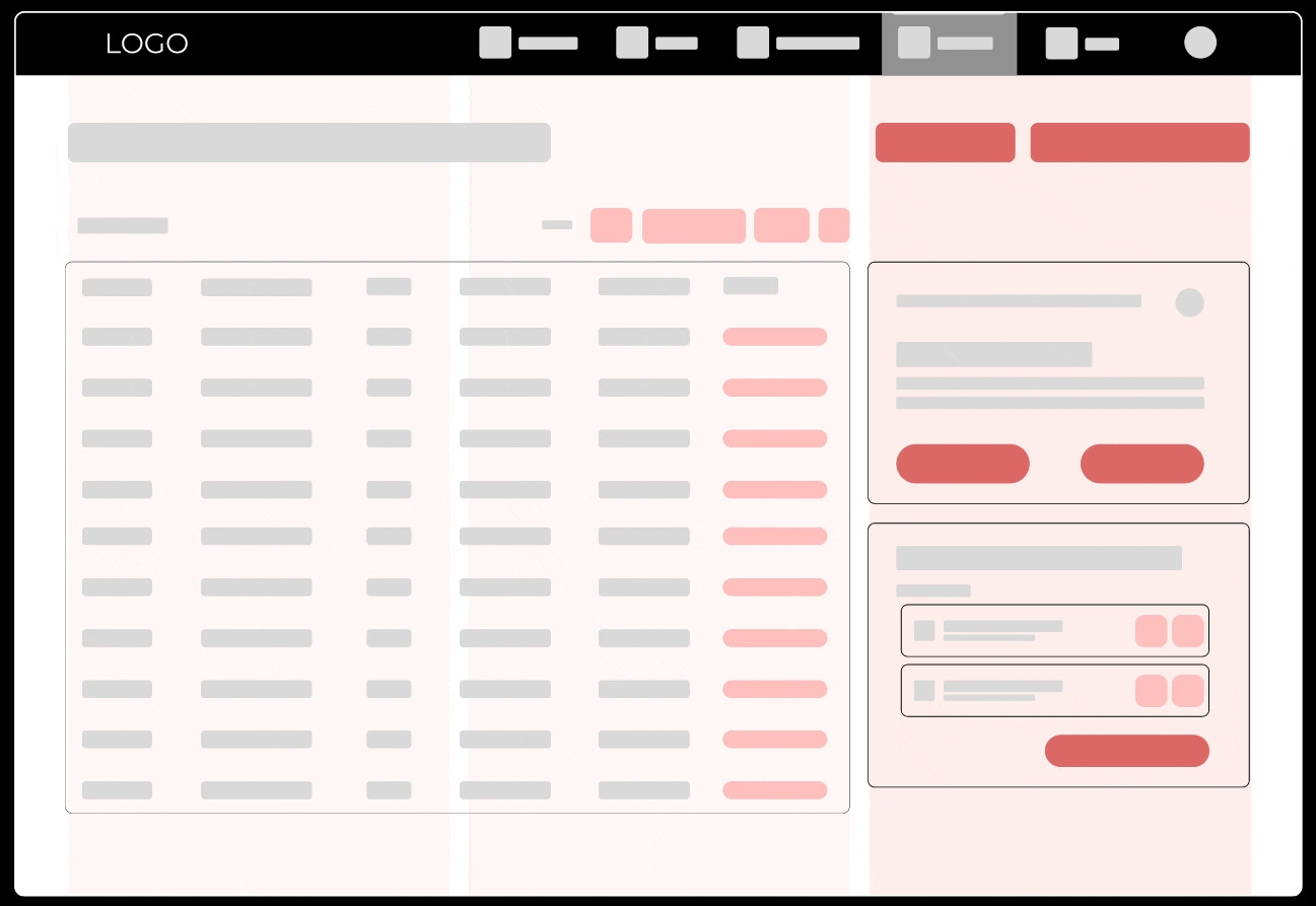
5. Left & Right-hand layout:
The concept I introduced was ‘Grouping Primary CTAs in the frequently interactable area’, (1/3rd area towards the left and right). This enables users to change the layout of the application with respect to their dominant side.
Right-handed layout

Left-handed layout
Low-fidelity mockup
![]()
High-fidelity mockup
![]()
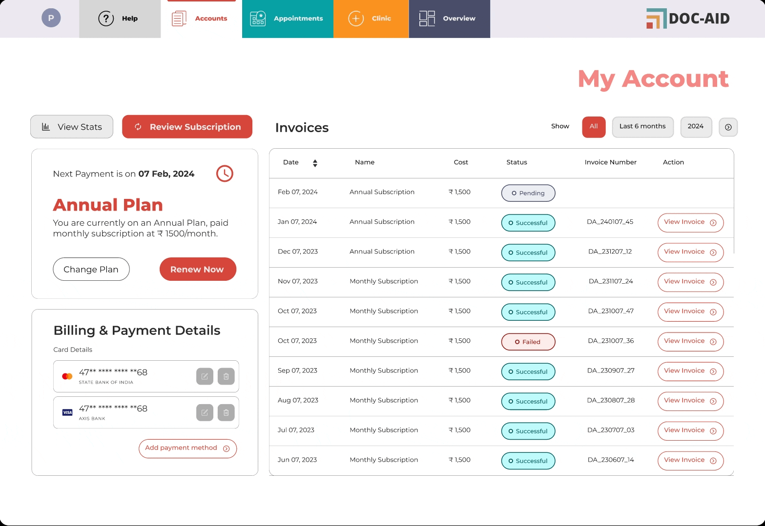
Final Design
Some of the UI screens for Doc-Aid
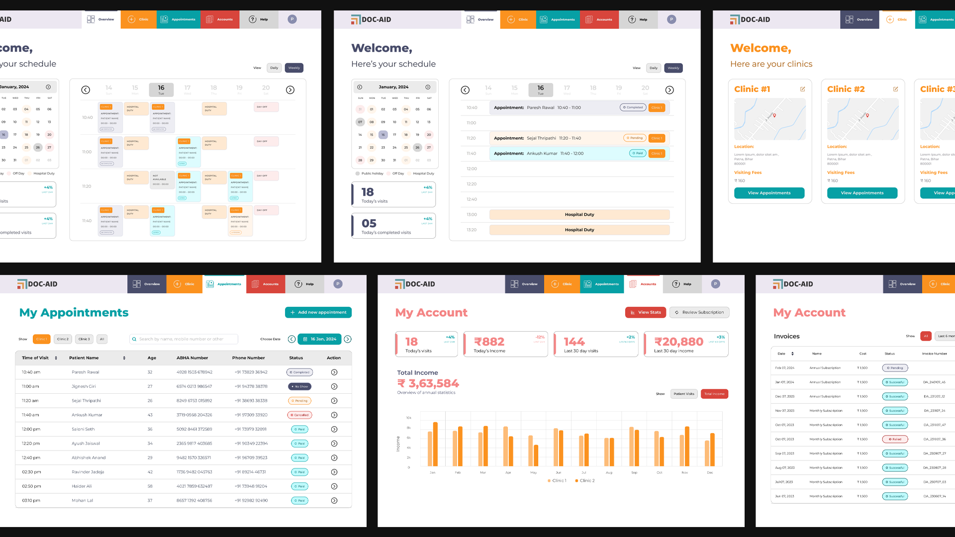
I can not show the prescription generation portal as a part of the NDA.
However I am happy to talk about the process and considerations taken during its design.
OUTCOME
Impact
The user-friendly and intuitive design increased user satisfaction and made it easier to manage doctor schedules, which improved the adoption rate.
The online booking process decreased paperwork errors and patient wait times.
The online booking process decreased paperwork errors and patient wait times.
8.4%
increase in daily active users
14.8%
increase in the Net Promoter Score with the new design
25%
faster response time on tasks by left-handed users with left-handed layout