MY ROLE: User Experience Designer
TEAM:
3x Designers, 5x Developers,
1x Product Owner
TEAM:
3x Designers, 5x Developers,
1x Product Owner
DELIVERABLES:
1. Figma component Library
2. Design tokens & Style guides
3. Adoption Seminars
1. Figma component Library
2. Design tokens & Style guides
3. Adoption Seminars
CONTEXT
Overview
To give you an idea of our design team, we are three members, two visual designers and a UX designer (me), and we have split all the design, research and testing activities amongst ourselves.
For building the MVP and working together this long we had a fairly strong grip on Doc Aid’s design style and how the components would look and feel.
Now we have outgrown our MVP stage and are expanding our design team (more than doubling)
For building the MVP and working together this long we had a fairly strong grip on Doc Aid’s design style and how the components would look and feel.
Now we have outgrown our MVP stage and are expanding our design team (more than doubling)
OBJECTIVE
The Challenge
Ensure that even with added complexity, the Design System remains easy for any designer or developer to understand and use
EXPLORATION
Research

Looking at existing design systems and to take inspiration from, we looked into Atlassian, Polaris (Shopify), Material Design 3 and Fluent Design systems and it was clear that the key elements for creating a design system library were
1. Foundational Elements (Color, Type, Spacing/grids)
2. Component Library (Atomic design, Reusable Components)
3. Documentation (Usage guidelines, Version Control, code snippets)
Upon reviewing our current components’ patterns and styles, though usable for a team of 3, but is very messy and cluttered and needs immediate action to streamline the design process and to make it easier for a new designer to use various assets.
PROBLEM STATEMENT
Define
Ultimately, this system is going to be used by designers and developers at Doc Aid, so the three main questions we wanted to answer with this system is
1. What are to be included or defined in this System?
2. How can the users find what they are looking for?
3. How can the designers and developers maintain this library and keep up with updated component versions?
WORK-FLOW
Design
Q1. What are to be included or defined in this System?
First, we included two playbooks, with the foundations being similar for both
(i) For the Brand
(ii) For the Products
I took the lead on Product - Design System and I’ll be talking only about this here.
First, we included two playbooks, with the foundations being similar for both
(i) For the Brand
(ii) For the Products
I took the lead on Product - Design System and I’ll be talking only about this here.
BRAND:
1. Values & tone of voice
2. Typography
3. Weights & Scale
4. Sizing & Lockups
5. Color Palate
6. Icons & Illustrations
1. Values & tone of voice
2. Typography
3. Weights & Scale
4. Sizing & Lockups
5. Color Palate
6. Icons & Illustrations
PRODUCT:
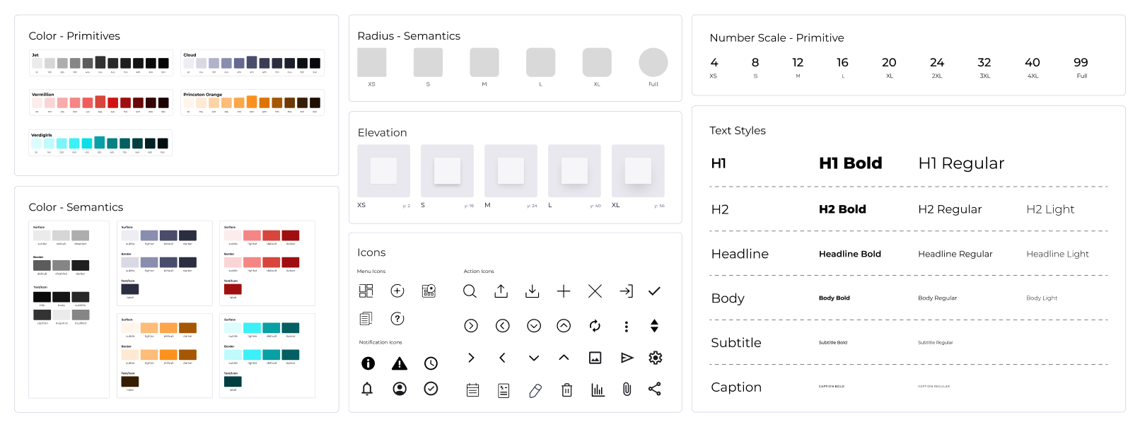
1. Colors (Primitives & Semantics)
2. Typography & Icons
3. Number Scale
4. Materials
5. Components
6. Grids
1. Colors (Primitives & Semantics)
2. Typography & Icons
3. Number Scale
4. Materials
5. Components
6. Grids

Q2. How can the users find what they are looking for?
To help users easily find what they are looking for, the following considerations were taken.
(i) Easy-to-understand file structure
(ii) Standardized Banner Thumbnails for each Design File
(iii) Standardized Page names for design files
Below is the File structure on how might designers and developers navigate through to reach where they desire

Project Files
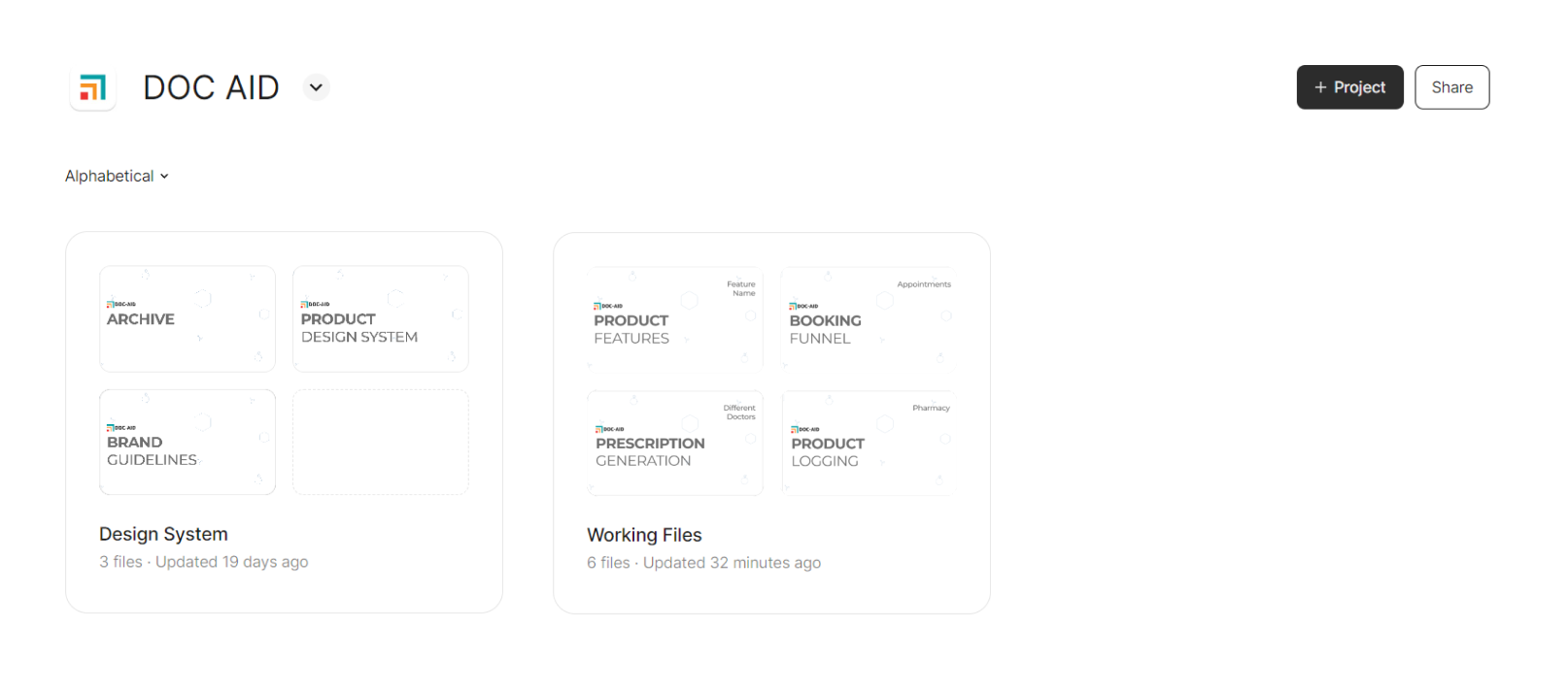
Project Files> Design Systems
⚙️ EDIT ACCESS: Design & Dev Team Leads
👁️ VIEW ACCESS: Everyone
![Figma design systems page]()
As you can see all the design files have a standard thumbnail.
For Working files, there is a template for new files that can be duplicated and pinned for easy access.
⚙️ EDIT ACCESS: Design & Dev Team Leads
👁️ VIEW ACCESS: Everyone
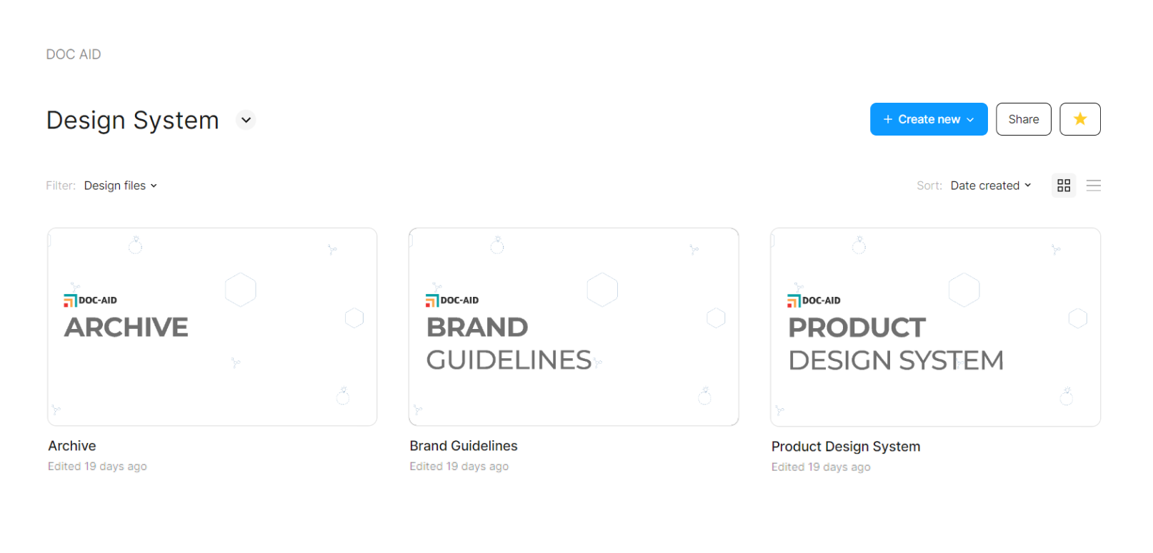
As you can see all the design files have a standard thumbnail.
For Working files, there is a template for new files that can be duplicated and pinned for easy access.
Project Files> Working Files
⚙️ EDIT ACCESS: The assigned design team & Devs
👁️ VIEW ACCESS: Anyone can request
⚙️ EDIT ACCESS: The assigned design team & Devs
👁️ VIEW ACCESS: Anyone can request

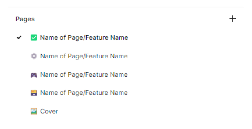
Page names
Icon meaning for various page names
✅ - Completed & Validated
⚙️ - Work in Progress
🎮 - Prototype
🗃️ - Archive (Previous versions/ Explorations)
🖼️ - Cover
To keep all the users on the same page within design and dev teams we introduced status tags that are added to the work file.
The status tags have 5 states:
(i) IN PROGRESS:
When the design team are working on it
(ii) READY FOR REVIEW:
When the design is completed and ready to be validated
(iii) READY FOR DEV:
This feature/component can be sent for development
(iv) COMPLETED:
When the feature/component is pushed. The component/feature is then updated in the archive file
(v) REDACTED:
This is either flagged after reviewing or in the archive file when the feature/component is updated
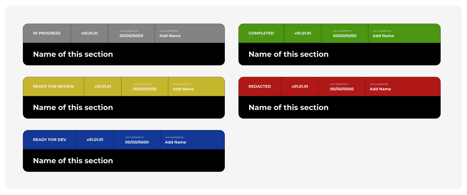
Work File Status
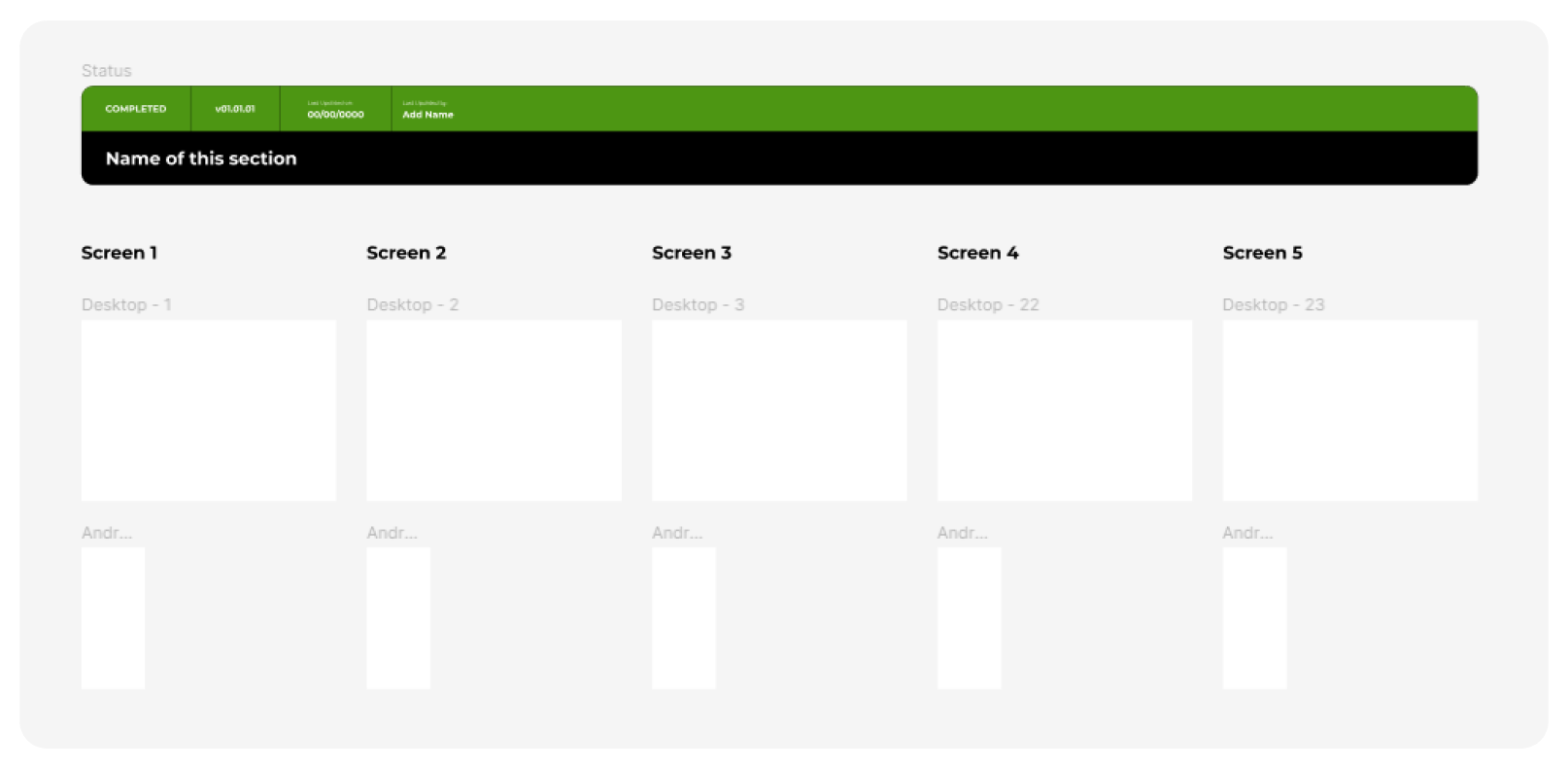
Feature life-cycle

OUTCOME
Component Library
~17%
reduction in design-prototype-test time for features (*Note: data derived from the teams’ monthly scrum sheets)I do understand that everything mentioned above was more about the workflow between cross-functional teams rather than the actual design system.
It is as important to have this workflow defined as a part of the design system because what works for 3 people will not work for 30 people but what works for 30 people would work for 3 people.
Please note that here I am explaining the design system using the atomic design framework because it is easy to understand and I haven’t named the components as, foundations/atoms/molecules/organisms but instead are grouped/named based on their functional purpose as it makes more sense for everyone using it.
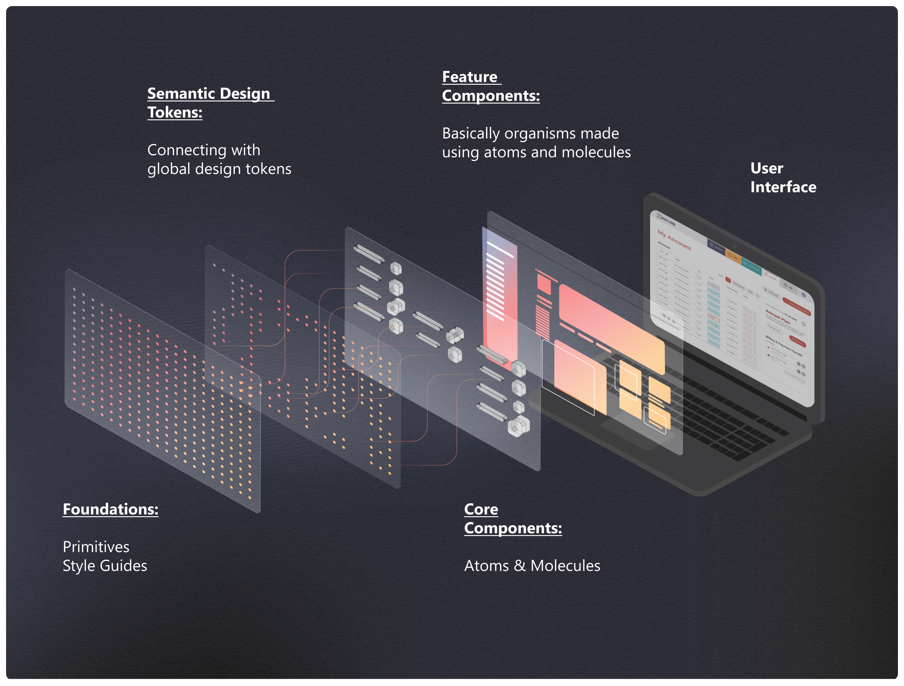
1. Foundations 🧬
2. Atoms ⚛️
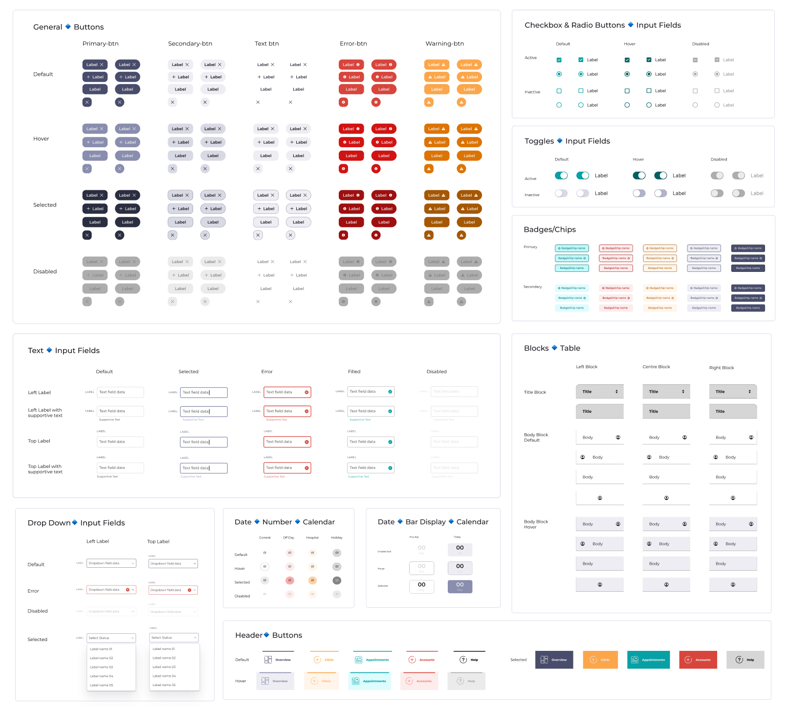
3. Molecules ⚛️⚛️
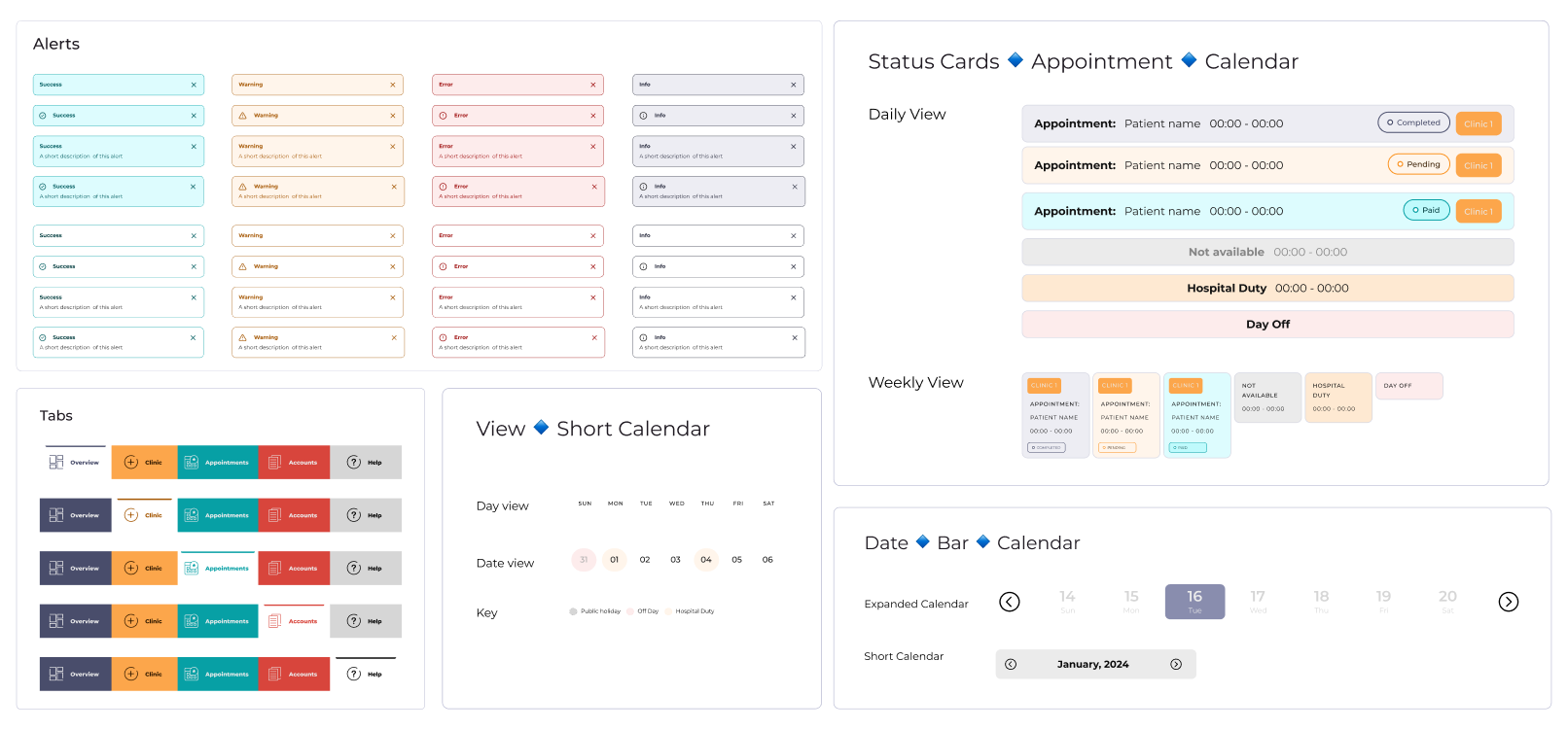
4. Organisms 🦠
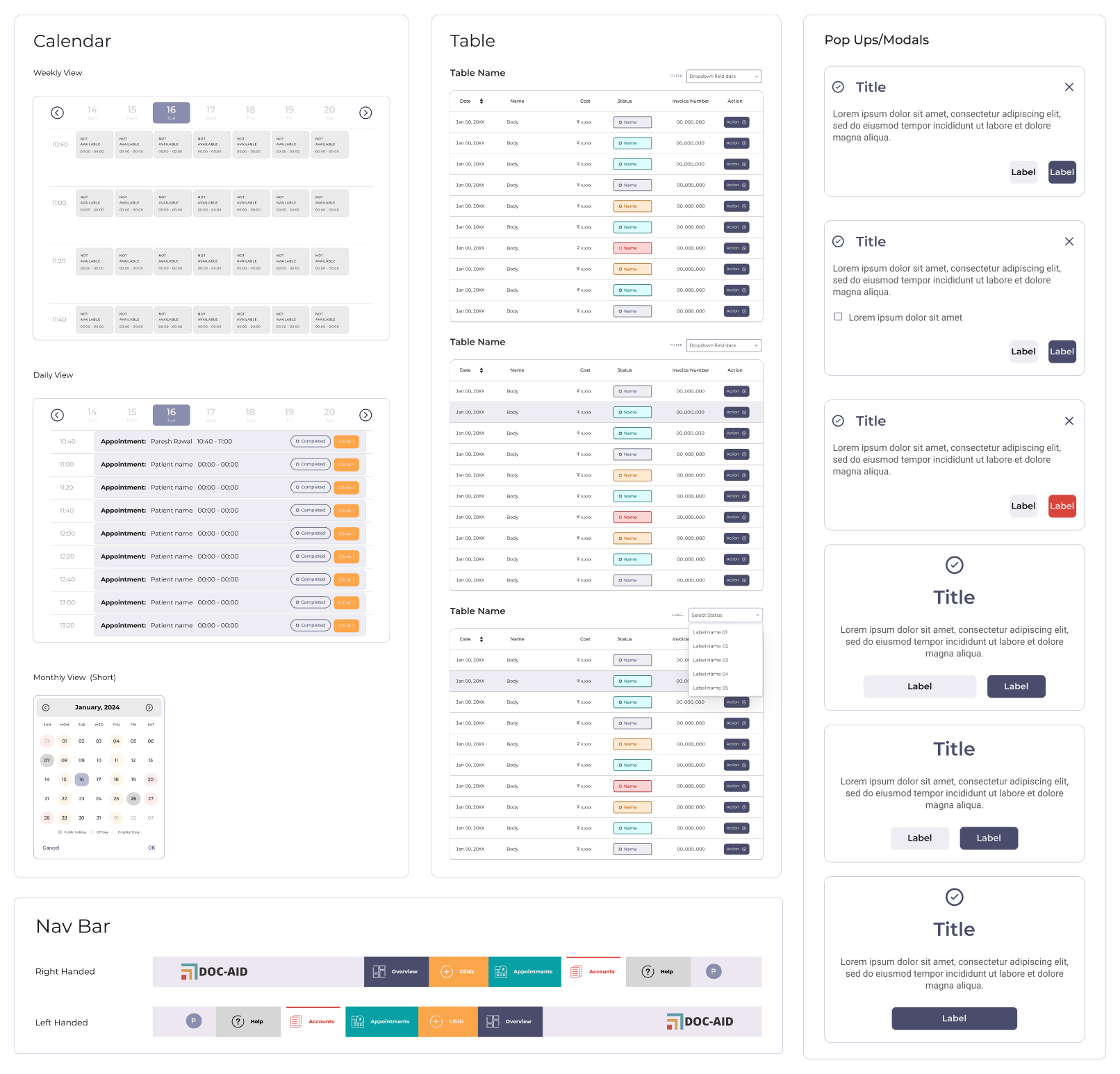
5. Pages 📄️